How to choose art for a room you actually live in
Most advice about art treats it as the final touch — the thing you add once the room is done. This is wrong on two counts. Art is not a final touch; it is a structural decision. And the room is never done.The result of treating art as decoration is rooms full of inoffensive prints that match the cushions. Generic landscapes. The same Matisse cutout everyone else has. Art that has been chosen to not clash with anything, which is another way of saying art that has been chosen not to do anything at all.
A room that includes a person living in it should include art that person actually likes. This sounds obvious. It is, in practice, rare.What follows is not a list of artists to know. It is an argument about how to think about the wall.
Start with what you actually look at
Before any decisions about size, framing, or where to hang, a single question: what do you look at, voluntarily, when no one is watching? Not what you think you should like. Not what would photograph well. What stops you when you scroll. What you have screenshotted and never used. What you noticed in someone else's home and could not stop noticing.
This is the only reliable input. Everything else — the proportions, the framing, the placement — is solvable. Taste cannot be reverse-engineered from a room. It has to come from the person living in it, or the art will read as decoration, which is the same as reading as nothing. The exercise: open your camera roll. Find the five images of art, objects, places, or scenes you have saved without a reason. Look at them together. The thread between them is your eye. Buy in that direction.
One large piece beats three medium ones
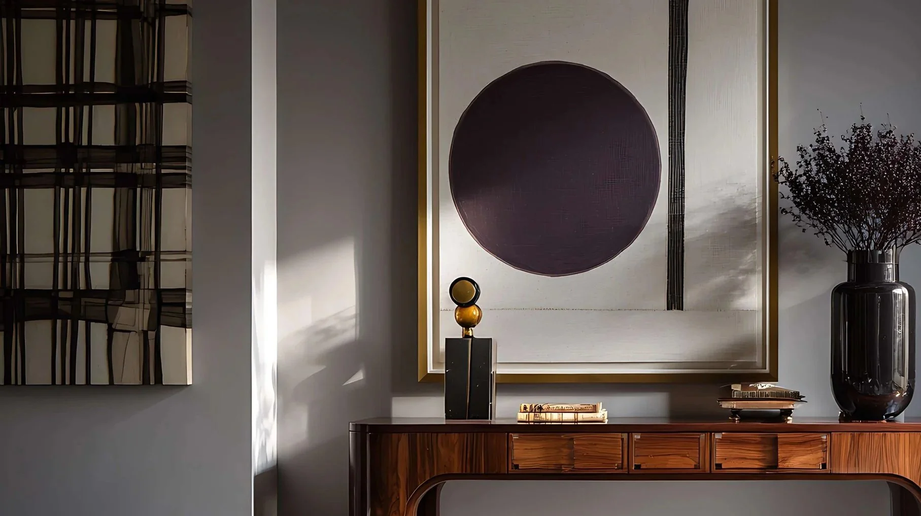
The default mistake is the gallery wall. Seven small frames in a grid above the sofa. The intention is "considered" — the result is busy.A single large piece does more work for less effort. It anchors the wall. It gives the eye a place to rest. It signals confidence — that one thing has been chosen, not seven hedged.
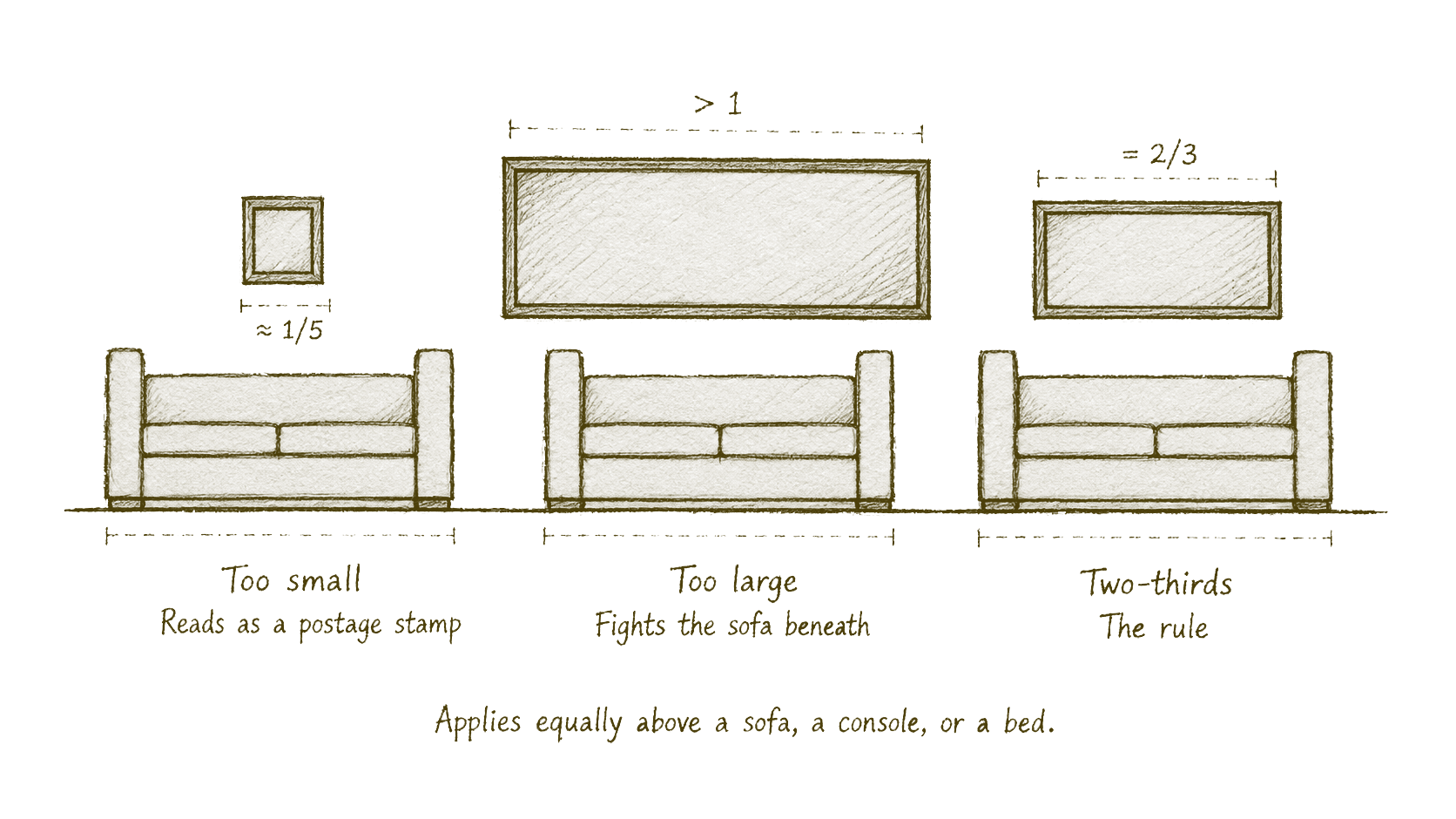
The proportion that matters: a piece above a sofa wants to be roughly two-thirds the width of the sofa beneath it. Above a console, two-thirds the width of the console. Above a bed, two-thirds the width of the bed. Smaller than that reads as a postage stamp; larger than that fights the furniture. If the budget is the same — one large print framed properly versus seven small unframed prints — the large one wins every time. Spend on size before you spend on quantity.
The frame is half the object
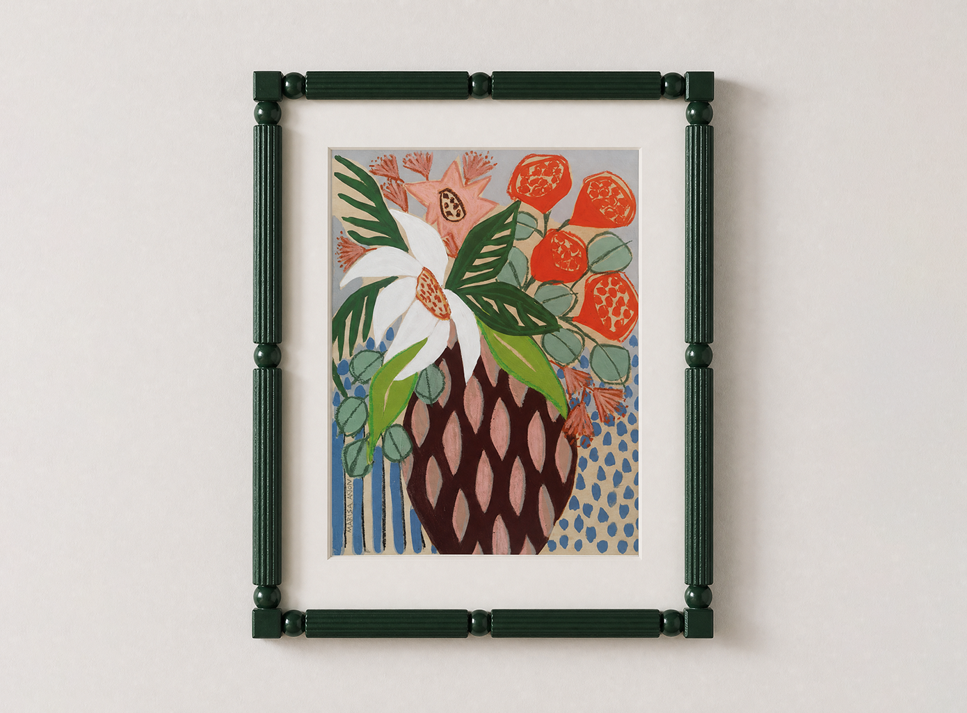
A good print in a bad frame looks like a poster. A modest print in a good frame looks like art. The frame is not a wrapper; it is part of the work. The principles, in order of importance.
Material. Solid wood, in oak, ash, walnut, or matte black. Avoid lacquered finishes, fake-wood plastics. The frame should look like furniture, not packaging. Thin profiles read contemporary, deep profiles read traditional; the error is the middle.
Margin. The white space between the image and the frame — the mount, or mat — does more than people realise. A generous mount makes a small print feel significant; a tight mount makes a large print feel cramped. As a rule, at least 5cm on each side, 8–10cm for larger works. Most off-the-shelf framing under-mounts.
No mount. A mount is not always the right answer. Bold graphic posters, contemporary photography, oil paintings, and any work where the image runs edge to edge read more confidently with no mount at all. The test: if the image has its own white space within it, mount it. If the image fills the surface, consider going without.
A mount as composition. Between the conventional mount and no mount sits a third position. Coloured mounts — oxblood, slate, ochre, charcoal — replace the default off-white and read as exhibition-grade when muted (avoid vivid). Offset mounts break the centred convention: a weighted bottom margin compensates for optical centre, or the image is pushed deliberately off-centre within a larger mount. Float mounting places the image on top of the mount with the paper edges visible, right for deckle-edged prints and fine-art papers where the edge is part of the work.
Glass or no glass. Glass protects the work and adds reflection. Anti-reflective glass exists and is worth the upgrade for any print over £100. For posters and lower-stakes pieces, an unglazed frame reads more casual.
The retailers worth knowing have built their businesses on framing as much as on the prints. King & McGaw frames to order with custom and coloured mounts.
Poster Club's standard oak frame is a near-perfect default for unmounted contemporary work. Wall of Art covers both ends — minimal pine for posters, deeper oak for serious pieces. For more decorative frames that can really add value to a piece, look to Anthropologie who carry elevated and expressive pieces.
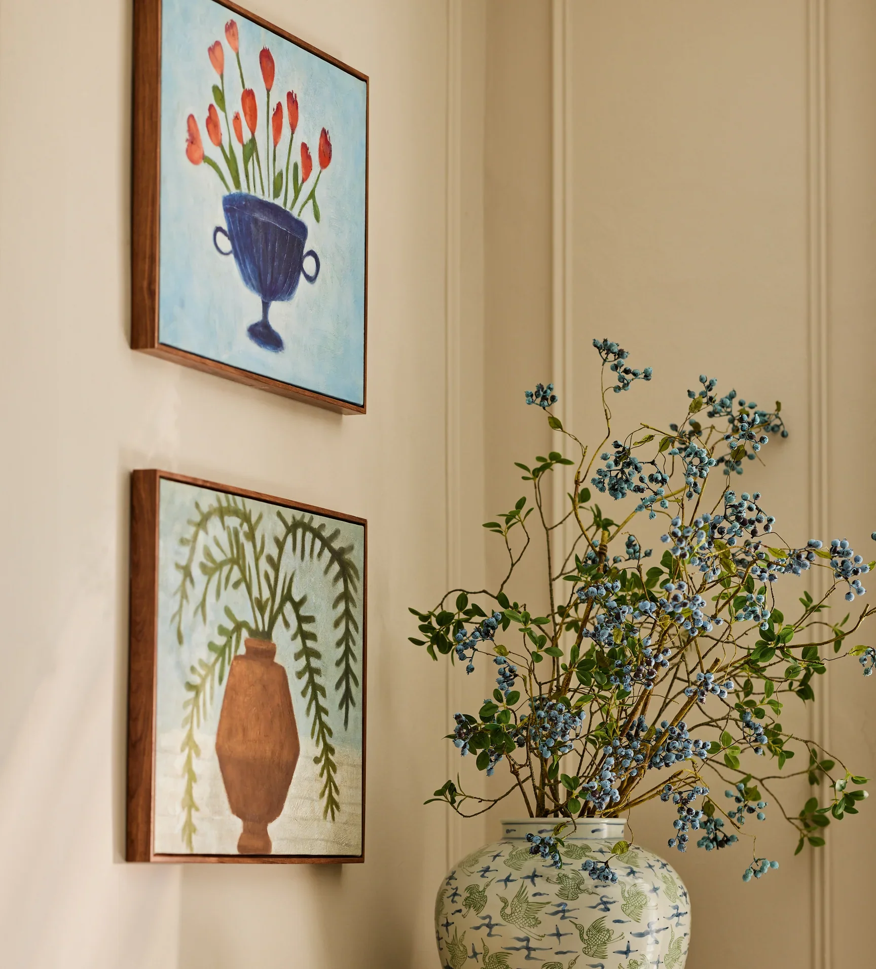
Mix old and new
A room of entirely new prints looks like a showroom. A room of entirely vintage prints looks like a junk shop. The interesting rooms mix the two. One vintage piece — a flea-market find, an inherited frame, a botanical from a print fair — in a room of otherwise contemporary work changes the temperature of everything around it. It signals time. It suggests the room was built over decades, not bought in a season.
This does not have to be expensive. Etsy carries usable vintage prints from £15 to £80. Vinterior carries the more serious end. A weekend at an antique fair will produce two or three pieces. The framing budget matters more than the print itself; a £20 vintage botanical in a £80 oak frame reads as considered. The reverse — a £200 print in a £15 frame — reads as cheap. The vintage piece should not match the others. The point is the contrast.
Saatchi print in an Anthropologie picture frame
Hang lower than instinct suggests
The most common hanging mistake mirrors the most common pendant mistake: too high. A piece above a sofa should sit roughly 15–25cm above the back of the sofa — not floating two feet up in the empty space, dislocated from the furniture beneath it. The piece and the sofa should read as one composition. If there is a noticeable gap between them, the piece is too high.
A piece on a blank wall — no furniture beneath — should be centred at roughly 150cm from the floor to the middle of the piece. This is the museum-standard eye-line. Most rooms hang well above it. The test: stand in the middle of the room, look straight ahead. The centre of the piece should be near the line of your gaze. Not above it.
Buy series
The most overlooked decision in art-buying is whether to buy a piece or a body of work. A single piece is a one-time decision. A body of work — three or four prints from the same artist, or three or four prints in the same medium across different artists — becomes a theme. Themes age better than statements. A room that contains four restrained line drawings in matching oak frames reads as curated. A room that contains four unrelated "statement pieces" reads as a mood board.
This does not mean buying a matching set from a single retailer. It means letting one decision inform the next. If the first piece is a black-and-white photograph, the next can be a charcoal sketch. If the first piece is a botanical print, the next can be a still-life in similar tones. The relationship is editorial — what would sit alongside this? — not literal.
The retailers that support this thinking well are the ones with deep, curated catalogues rather than scattered single hits. King & McGaw's collections (organised by movement, by colour, by artist) and Oka’s wall art are designed for this. Poster Club's grouped sets do the work for you. The harder retailers — Etsy, vintage marketplaces — require you to do the editing yourself, which is also the more rewarding work.
A note on price
Art is the category where people most often spend either far too much or far too little. The £8 unframed poster is a placeholder; the £8000 limited edition is over-committing for a first home. The interesting price band — the one that produces rooms worth looking at — sits between £60 and £250 framed. In that band, the right retailers carry serious work: archival prints, signed editions, considered framing. Below it, the work is mostly decorative; above it, the work is mostly an investment.
If the budget for the room is finite, the order is: one larger piece in the £150–£250 band, then one or two smaller pieces in the £60–£120 band, then everything else. Spend on the anchor. Save on the supporting work.
What art is for
The room you live in is a room that has been chosen by you, slowly, over years. The art on its walls is the most personal part of that choice. It is also the part most often delegated — to whatever was on sale, to whatever matched the cushions, to whatever was easiest. The walls of a room are the only surfaces in it that have nothing functional to do. They exist purely to be looked at. What a person chooses to put on them is, more than the sofa or the rug or the lamps, a record of what that person wants to live with. Choose accordingly.