Shelf styling
A shelf is the most exposed surface in a room. Everything on it is visible from every angle. There is no upholstery to hide behind, no rug to anchor against, no architecture to compensate for a poor choice. What sits on the shelf either composes or doesn't. This is what makes shelves either the best or worst surface in a home. A well-balanced shelf reads as a room within a room — a small considered world, repeating in miniature the principles of the larger space. A poorly balanced shelf reads as storage — a place where things are kept, not displayed. The difference is rarely about what is on the shelf. It is almost always about how the things on the shelf relate to each other. What follows is how to think about that relationship. Not a formula — there is no formula — but a set of principles for composing three objects, or thirty, on a horizontal surface.
Start with what a shelf is for
Before composition, the question of intent. A shelf can do one of three things: it can store, it can display, or it can do both. The mistake is assuming a shelf can do both without distinction. Most cannot. A bookcase full of paperbacks read for reading, with a small object or two between them, is storing. A pair of carefully chosen vintage books between bookends, with a ceramic vase beside them, is displaying. The two registers do not mix on the same shelf without one undercutting the other.
The first decision, then, is to know which mode each shelf is in. A reading bookshelf does not need to be styled; a styled shelf does not need to function as storage. A piece of furniture with multiple shelves can hold different modes on different shelves — books read for reading on the lower shelves, displayed objects on the upper — and this is often the cleanest answer for a whole bookcase.Once the mode is decided, composition begins.
“A shelf works when it contains both repetition and contrast.”
Three classes of object
Any shelf intended for display contains three kinds of object, in some proportion. Each behaves differently. Each does different work.
Books. Books are the building block of most well-composed shelves — the rectangle that gives the eye something regular to read between the irregular objects. They bring colour at the spine, line at the edge, and horizontal or vertical mass depending on how they are stacked. A stack of three or four lying flat is a small plinth; a row standing upright is a wall. The mistake is treating them as filler. A row of paperbacks with worn spines, included to take up space, drags the composition down. If books are on display, they must earn their place — hardcovers, considered titles, spines in colours that work together. Reading books live elsewhere. For displayed books worth keeping, vintage hardcovers from sellers on Vinterior or 1stDibs often outperform new editions, both visually and in the patina they bring.
Ornaments. The non-functional objects — vases, ceramics, sculptures, small wooden carvings, bowls, candleholders, framed photographs. Ornaments are the vertical element on a shelf. Where books bring horizontality, they bring height. The temptation is to use too many. The strongest shelves use ornaments sparingly — one or two per visual section, chosen for their individual presence rather than their collective impression. Three of the same object grouped together can work as deliberate repetition; five small objects clustered rarely does. For ceramics that hold their own visually, the considered end of the high street — Toast, Nkuku, Soho Home — tends to outperform decorative homeware specialists, where the pieces are designed to be seen at a distance rather than lived with.
Plants. Plants are the wildcard — movement, organic shape, the suggestion of life in what is otherwise a still composition. A plant on a shelf changes the register of everything around it: books and ornaments read as objects, plants read as alive. One per shelf is the usual maximum; two compete and dilute the effect. Trailing plants extend the composition downward and soften the edge; upright plants extend it upward. For shelves without enough light for living plants, cut stems in a vase — a single eucalyptus branch, a few stems of dried grass — read similarly and last longer than people expect.
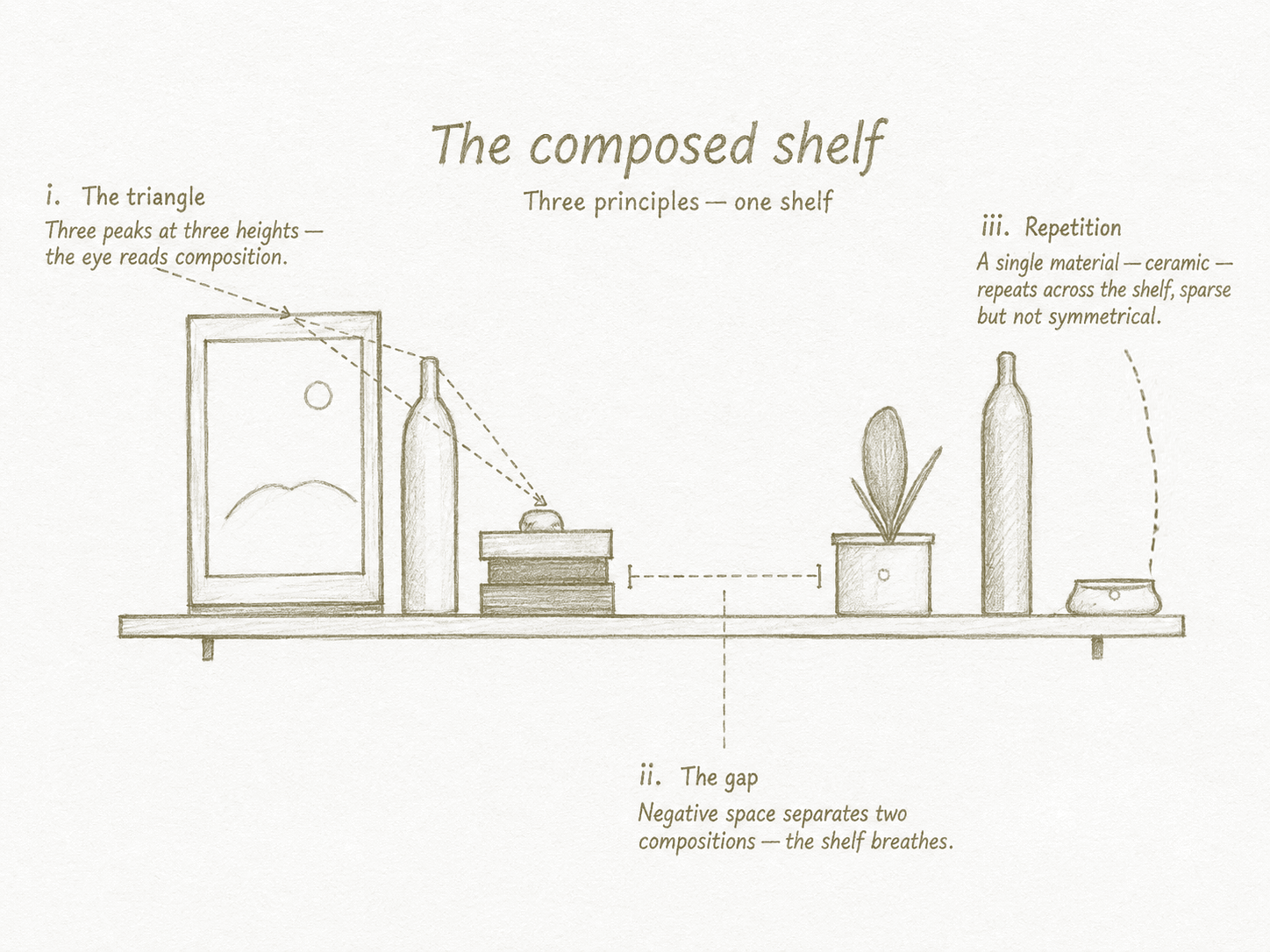
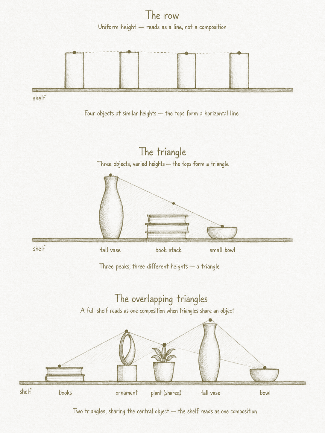
The principle of triangles
This is the rule that does the most work, and the one most invisible once learned.
The eye looks for groupings of three. A shelf composed in triangles — where the heights of three nearby objects form a triangular relationship rather than a straight line — reads as composed. A shelf where objects are arranged at uniform height reads as a row.
The triangle does not have to be obvious. Three objects at descending heights — a tall vase, a medium stack of books, a small bowl — form a triangle when viewed together. Two objects of similar height with a third significantly taller or shorter forms a triangle. The principle is variation, not symmetry.
The corollary: avoid even numbers in close groupings. Two objects side by side read as a pair, which is a different register (more formal, more decorative). Four objects read as a row. Three objects, varied in height, read as a composition. This is why interiors writing repeats the rule of three so often — it is the smallest number that creates a triangle.
A whole shelf can be composed as a series of overlapping triangles. A book stack, an ornament, and a plant on the left form one triangle. The plant, a tall vase further along, and a small bowl on the right form another. The two triangles overlap in the middle, creating a shelf that reads as a single composition rather than two separate ones.
Repetition and contrast
A shelf works when it contains both repetition and contrast. Repetition gives the eye something to track — a shape, a colour, a material that appears twice or three times along the shelf. Two ceramic vessels in different sizes at opposite ends, both in the same off-white glaze. A wooden object on the left, a wooden book block in the middle, a wooden frame on the right. Without repetition, the shelf reads as a random collection. Contrast gives the eye something to land on — a single object that stands apart in colour, material, or scale. The black bowl in a shelf of cream and oak. The one bright cover among the muted spines. The tall stem of dried pampas in a composition that is otherwise low and horizontal. Without contrast, the repetition becomes monotony. The discipline is to do both on every shelf. Pure repetition is dull. Pure contrast is busy. Together they produce a composition that holds the eye and rewards a second look.
Books, in more detail
Because books carry so much of the work, a few notes on how they sit.
Stacked vs. standing. Stacks of books (lying flat, three or four high) create a horizontal mass that grounds the composition. Standing books create vertical mass. Most shelves use both — some sections standing, some stacked, each bringing a different rhythm.
Bookends. Books standing upright on a shelf without filling it end-to-end need bookends. A line of standing books that trails into empty air reads as missing something. The bookend — a heavy ceramic, a small ornament, a carved wooden block — becomes another object in the composition.
Pages facing out. Turning a stack of books with the page-edges outward rather than the spines is a styling trick used to mute the visual noise of mismatched spines. It works in moderation — one or two stacks turned, the rest spine-out — but reads as affected if done across a whole shelf. The studio's view: spine-out unless you have a specific reason not to.
Negative space — the most underused element
After triangles, the second principle: leave gaps. The mistake on most shelves is to fill them. Every square centimetre of horizontal surface holds something. The composition becomes a wall of objects, and the eye has nowhere to rest. A well-composed shelf is roughly 60–70% full and 30–40% empty. The empty parts — the negative space — let the filled parts breathe. They also let the shelf itself, the line of the wood or the colour of the wall behind, become part of the composition.
The test: stand back from the shelf, narrow your eyes, and see whether the gaps read as deliberate or as places you forgot to put something. Deliberate gaps look intentional even from across the room. Accidental gaps look unfinished. A trick that helps: build the shelf, then remove one object. Whichever object the shelf survived losing is the object that was not earning its place. Repeat until removing anything would weaken the composition.
“The mistake on most shelves
is to fill them.”
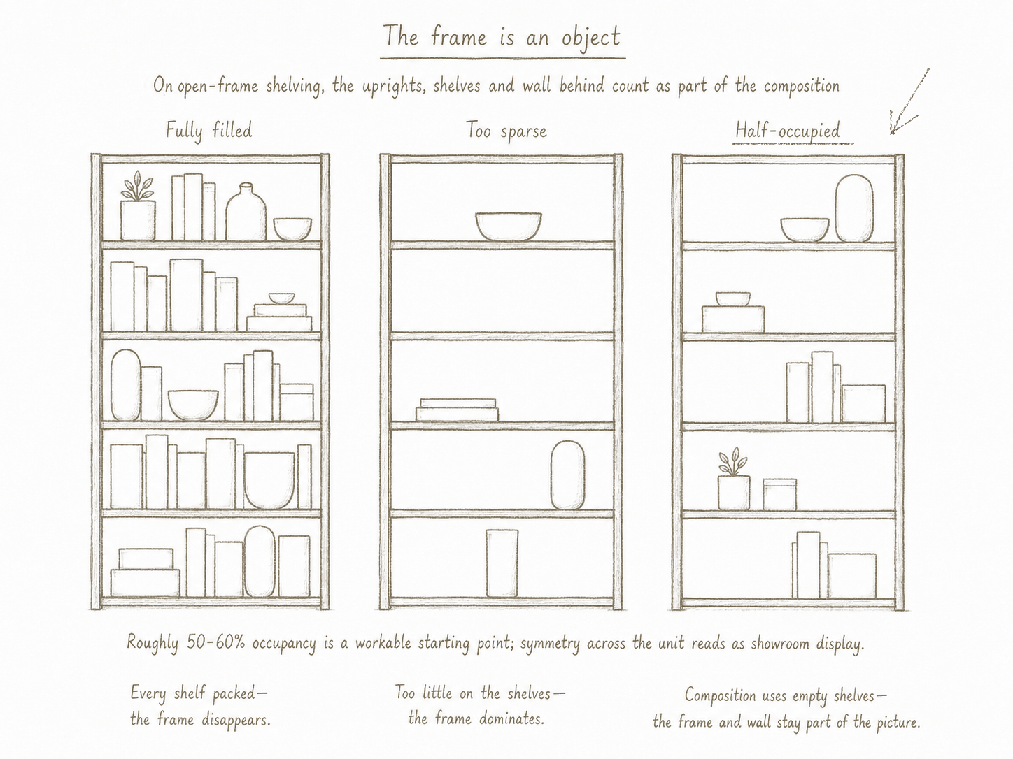
Stacked and unit shelving
The same principles scale to multi-shelf furniture, but with new considerations specific to the format. A closed bookcase — a piece of furniture with sides and a back — reads as a single object containing several shelves. The composition lives within the frame. Open-frame unit shelving — Vitsoe, String, Tylko, modular wall systems — behaves differently. The shelves are visible as surfaces, the frame is part of the composition, and the wall behind shows through. The eye reads not just what is on the shelves but the negative space between them.
This changes the rules in three ways.
The frame is an object. With closed bookcases, the wood of the case fades into the background. With open-frame systems, the vertical uprights and horizontal shelves are visible. They count as part of the visual mass. Filling such a unit completely buries the frame and produces a heavy, busy result. Leaving more negative space — including whole sections of shelf empty — lets the frame and the wall behind it remain part of the composition.
Vertical sight-lines matter as much as horizontal ones. The eye reads up and down an open unit as readily as left and right. This means an object on the second shelf is in visual conversation with the objects directly above and below it, not just beside it. The triangle principle applies vertically too: a tall vase on the top shelf, a horizontal book stack on the middle shelf, a low bowl on the bottom shelf forms a vertical triangle that ties the three shelves together.
Distributed repetition holds the whole unit. A single material or colour repeated at different points across the unit — ceramic vessels at top-left, middle-right, and bottom-left — creates a rhythm that the eye finds without being told to look for it. The repetition needs to be sparse, not symmetrical; symmetry on multi-shelf units reads as showroom display rather than considered styling.
A practical approach for a five-shelf unit: treat alternating shelves as "anchor" and "rest" shelves. Anchor shelves carry the substantial compositions — books, ornaments, plant. Rest shelves carry one or two objects with significant space around them, or are left almost empty. This rhythm — busy, quiet, busy, quiet — prevents the unit from reading as uniformly full and gives the eye places to pause as it travels up and down.
A note on what not to do
The matching set of decorative books in fake leather, sold by interior designers as space-fillers. They read as fake on sight. The single perfect vignette repeated identically on every shelf — reads as showroom, not home. The over-styled shelf that has been arranged so carefully that nothing can be touched. Style for use, not for a photograph.
What composition is for
A balanced shelf is not an end in itself. It is the room's most precise expression of how the rest of the room thinks. The same principles that govern shelf composition — triangles, negative space, repetition with contrast — govern living rooms, bedrooms, kitchens. The shelf is the small version of the larger problem. If you can compose one shelf well, you can compose a bookcase. If you can compose a bookcase, you can compose a wall. If you can compose a wall, you can compose a room. The unit changes; the principles do not.