Lighting: understanding proportion
More rooms are undone by lighting than by any other single element. Not the style of lighting — most people choose lamps and pendants that suit their taste — but the scale and placement of them. A beautiful lamp in the wrong proportion to its surroundings will sabotage a room that otherwise works.T he good news is that lighting proportion follows a small number of rules. They are not creative judgements. They are closer to physics. Once known, they are difficult to unsee.
1. A pendant should hang lower
than instinct suggests
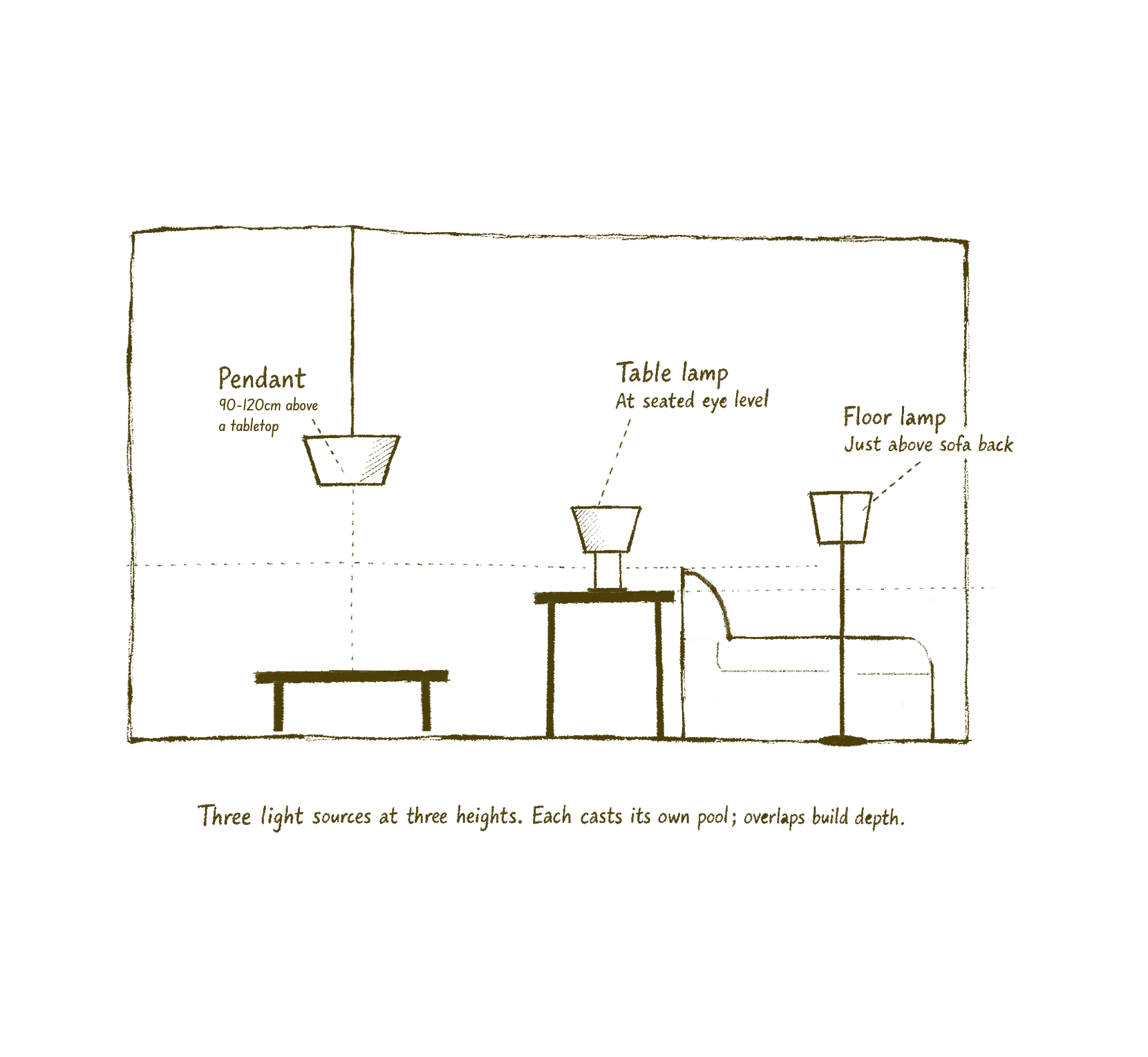
A pendant works hardest when it is closer to the surface it lights. Over a dining table, the bottom of the pendant should sit roughly 75–90cm above the tabletop — low enough that diners can see each other beneath it, high enough that nobody hits their head on standing. Over a kitchen island, a similar range.
Over a coffee table, the rule loosens. Without diners facing each other across the surface, the pendant can sit higher: 90–120cm above the tabletop, or roughly 150–180cm from the floor. High enough to clear standing head height as people move around the seating, low enough to feel part of the room rather than the ceiling. Coffee-table pendants almost always work as supplementary rather than primary light, sitting alongside table and floor lamps, so they can be smaller and lower-output than their dining-table counterparts.
In a hallway, where there is no surface, the rule shifts again: the bottom of the pendant should clear the tallest household member by at least 15cm, no more.
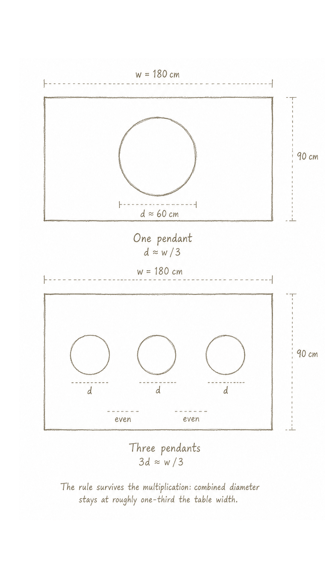
2. A pendant's diameter should be roughly one-third the width of the surface beneath it
A pendant over a 180cm dining table wants to be roughly 50–60cm in diameter. A pendant over a 90cm island wants 30cm. The instinct, again, is to go smaller: small feels safer, less assertive. The result is a light that floats above the table looking apologetic. The rule is forgiving. Anywhere between a quarter and a third of the surface width reads as correct. Below a quarter, the pendant looks lost. Above a third, it begins to dominate. The middle of that range is where most rooms settle naturally. For multiple pendants in a row — common over long islands — the combined diameter should hit the same one-third ratio, with even spacing between them.
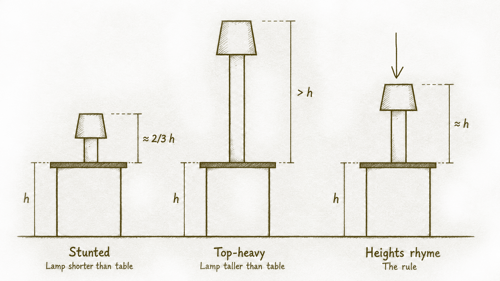
3. A table lamp should be roughly the same height as the surface it sits on
A table lamp on a 55cm side table wants to be about 55cm tall. A lamp on a 70cm console wants 70cm. The lamp and the surface read as a single composition; their heights should rhyme. What goes wrong: lamps bought without the side table in mind. A 45cm lamp on a 60cm table looks stunted. A 70cm lamp on a 50cm table looks top-heavy. The lamp is not chosen to the table, and the eye registers it as off without knowing why. A second proportion within the lamp itself: the shade should be roughly two-thirds the height of the base, and slightly wider than the widest point of the base. Shades that are too narrow read as caps; shades that are too tall obscure the form beneath them.
4. A floor lamp should rise just above the seating it accompanies
Floor lamps work in relation to the furniture they sit beside. A floor lamp next to a sofa wants its shade — or its bulb, if shadeless — to sit at roughly eye level when seated. For most sofas, this means a lamp between 150 and 170cm tall. Taller is acceptable when the lamp is meant to read as architectural: an arc lamp, a tripod, a piece chosen to occupy vertical space deliberately. Shorter rarely works. A floor lamp that sits below the back of the sofa reads as a side lamp that has wandered out of place. The test: when seated, the light source should be just above or behind the line of sight. Not in it, not far above it.
5. A room needs light at three heights
This is the rule that does the most work. Most rooms have one light source, usually overhead. The result is a flat room, evenly lit, with no shadow and therefore no depth. Photographs of such rooms look thin. The fix is to add light at two further heights: table (lamps on side tables and consoles, casting at seated eye level) and floor (a standing lamp casting upward, or a low light beside a sofa). Three heights, ideally all on dimmers or warm bulbs, builds a room with shadow and warmth. This is the difference between a room that photographs well and a room that lives well. The room that lives well has multiple small pools of light at different heights, with the overhead used sparingly or not at all in the evenings. The room that only photographs well has one bright overhead and looks like a showroom after dark.
6. The bulb matters more than the lamp
A perfectly proportioned lamp with the wrong bulb undoes itself. The two variables: temperature and brightness. Temperature is measured in Kelvin. Warm light sits around 2200–2700K — the colour of an old incandescent bulb, the colour of candlelight at the lower end. Cool light sits at 3000K and above, into the bluish range. For a living room, bedroom, or dining space, almost nothing above 2700K reads as warm. Most lamps sold with bulbs included come with bulbs that are too cool; replacing them is the single cheapest upgrade a room can have.
Brightness is measured in lumens. For a table or floor lamp meant for ambient light — not reading — 200 to 400 lumens is plenty. Most household bulbs are sold at 800+ lumens, which is too bright for atmosphere. A lamp on a dimmer, fitted with a 2700K bulb at 400 lumens, will produce a quality of light that no amount of money spent on the lamp itself can replicate. The lamp is the object. The bulb is the light.
Proportion rules are not creative restrictions. They are the underlying grammar of a room. Once they are followed, the room becomes a space where taste can do its work — choosing materials, colours, forms. Without them, taste is fighting against the structure. The rooms that look effortless are almost always the ones that got the proportions right first.